Project Overview.
This project was completed within the Strategy & Transformation business of PwC Australia
Role: Lead UX/ CX Designer
Dates: Aug 2016 - Mar 2018.
Skills used:
Business strategy
Workshop design
Foundational research
Ideation of creative
Directional research
Inclusiveness for all
Training of staff
Digital creative
Building awareness
Onboarding helpers
Training of users
Feedback from users
Design Thinking tools used: - Competitive analysis. Future state analysis. Rapid prototyping, Stakeholder meetings, Qualitative surveys, Foundational & directional research, the Frankenstein approach.
Some components created for this project: - Onboarding process (Advisor and Client), Advisor mapping screens (connecting external cloud data to appropriate accounts e.g. Xero, Sage One), Client facing main widget dashboard, widget content creation and full interactive prototype using Sketch/ Axure, connecting widgets to use the appropriate cloud data source (e.g. SharePoint), data visuals, Cashflow Coach product, sharing and permissions, behaviour of voice assistants, testing scripts, analysis of results, reporting back to Stakeholders.
Short brief: NEXT is to make advisors more compelling and proactive, and thus provide a more satisfying relationship for our clients. We want them saying "That's how I want to work with my accountant!"
Giving the advisory arm of PwC a winning edge:
The advisors at PwC had a fantastic relationship with their clients, and PwC wanted to utilise new cloud based technologies to enhance the offering, enabling PwC Next clients to have a total understanding of their financial situation at anytime. Their advisor, who previously would gather up account detail for clients could now offer tips and tools to enhance their financial situation, preparing forecasts and tax predictors, and start conversations that they previously never had.
I was brought in to the strategy and transformation team at PwC to better leverage these new technologies. Some of my experience came from weekend hack-a-thons, where I had completed a few winning projects that experimented with the possibilities of using big data to reveal insights. They had explored visualising API's and data and the possibilities of the cloud. I was extremely passionate about data and visualisations, however had no real knowledge on accounting!
There is definitely a steep learning curve when in comes to new projects. This was how I created value within the accounting realm.
After I had been on the project for about 5 months, I was asked to start exploring and developing the new widgets for NEXT Version 2.
What I had already done to understand the basics...
- Stocktake on the current offering looking at the functionality/ usability, users' ability to understand data, accessibility/ semiotics, and end to end experience.
As a new member to the team, I also asked myself - do I really understand what they do, or how to carry out a task? Did I have to re-read instructions, or did I second guess myself? If it's accounting and different widgets (our specialised area), I asked myself what skill level you need to have to understand what is being presented? Can I understand it as a newbie, or do I need prior understanding? Can you get this information at hand, or is it just assumed?
- Immersing myself amongst the advisors See what they do. See whether they have the same pain-points as I did. Do they stumble in the same areas, or have they discovered hacks to help them through? Do the advisors instruct people, or take over operating areas of the site for their client's? Ask Advisors and accountants about earlier findings during the stocktake - whether it's a common problem needing focus, or are there other areas that they think take priority.
- Competitive analysis. Usually considered as part of a marketing toolkit, but it's great to see what is happening in the "marketplace", how people try and sell their solutions to you, what they identify as important, and whether they focus on a niche to differentiate themselves amongst competitors. I also look at communication style, visualisations if working with API data, call to actions, and the way they allow people to onboard or trial their product as a first timer. One of the last notes I wrote was have they sold this product to me... would I use their service if I needed it? Why or why not?
- Chats with Key Stakeholders, people of interest Understanding how they are wanting to position the project, what they find most important, how they intend to sell the project, their KPIs, definition of success etc.
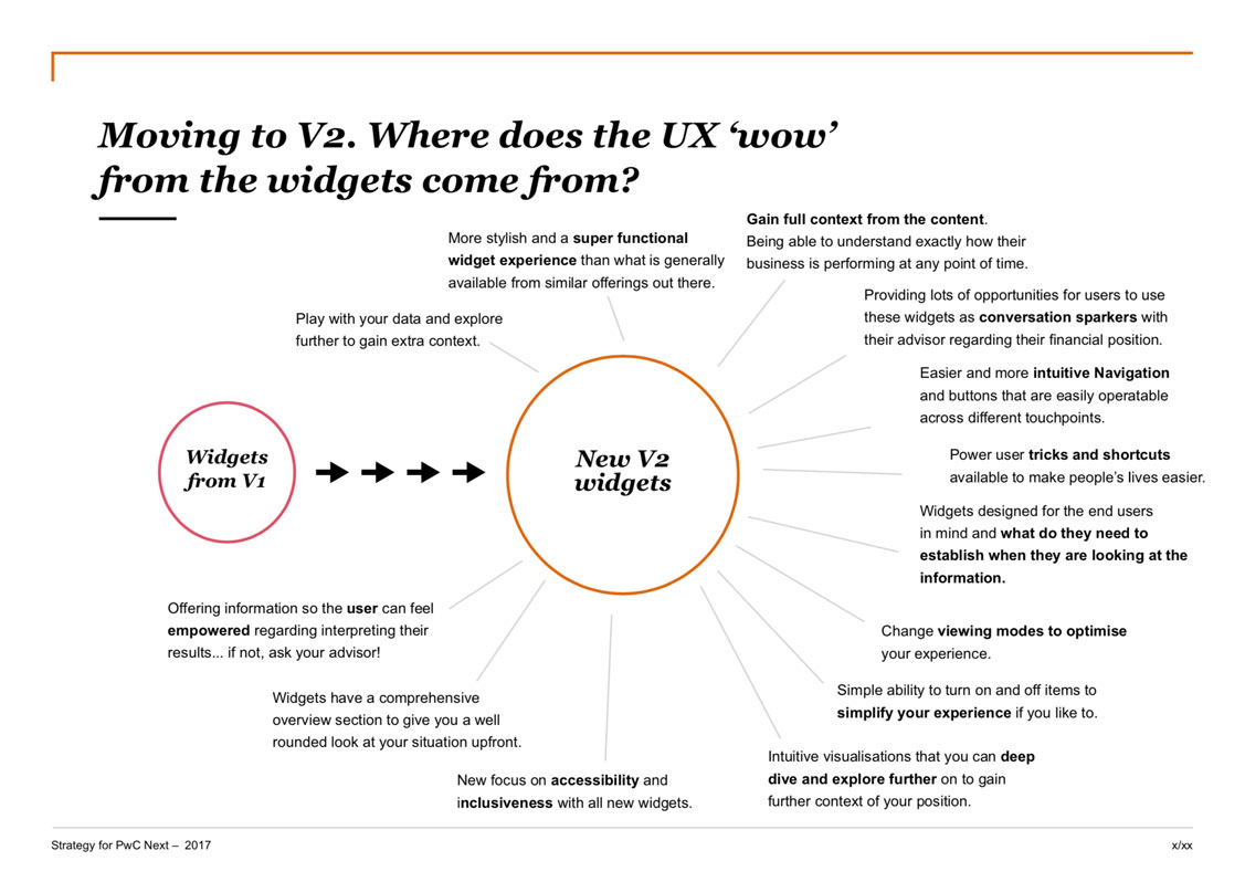
I had a lot of upskilling to do when it came to the rejuvenation of PwC next. I was tasked with redesigning 8 widgets as well as other key components for the site. Balance Sheet Widget was the first widget to be put within the new system, and see whether it would be what the stakeholders where envisaging. Big Ask.
I had created a document from all the prior knowledge gathered and entitled it: Moving to V2. Where does the UX "wow" for the widgets come from? This definitely was my most used document during the ideation phase, and it was used like a checklist to hold myself accountable when creating any new content.
The ideation phase... for the functionality of the new widget.
Pretty early on I had decided that every widget would need to tell a story. Your financial story is made up of many chapters and, when these chapters are combined... you will be enlightened!
- In Accounting, there are always items that people expect to see when you are dealing with their financials. These are a given, they work the way that they are, and to adjust them would be recreating the wheel. They are the bread and butter for some of the widgets, and so there was no point spending time here. e.g. Balance sheet table, as part of the balance sheet widget.
- During the course of ideation, I wanted to further develop the idea of the story. Stories have Characters, Context, and they move from one Scene to the next. Using the vehicle of stories I could expand to being able to: compare stories, story snapshot/ overview, bookmarking stories, featured stories etc. I found that these concepts transferred over to accounting well. I worked on this a lot further, apparent most heavily in widget navigation.
- Another trick was to see whether applying my UX tools to accounting would work. I tried this with a "retrospective" - which is what UX/ CX Developers conduct at the end of an agile sprint. Usually during this time participants mention what works well, what do we need to work on, etc - basically a feedback loop. If you put an accounting lens on it - in terms of Balance Sheet widget - it could be comments added from your advisor as action points, or things to look out for for next month to improve your overall position.
- In creating these widgets there were lots of interviews and sessions with the advisors, and stakeholders, finding out the tools and functionality they wanted to include in the redesign. Features were also proposed from myself after exploring online blogs and articles from accountants, or financial services regarding tips for preparation, what to look out for, problem areas people had etc.
- In finding my "wow" with the new widgets I always referred back to the master document, that summarised all my work from the stocktakes and interviews etc. This helped me align new items, to make sure they adhered to our goals, mostly those about building context around situations, enabling non-accountant minded people o understand their financial situation. Any feature had to be intuitive and provide ability to deep dive and explore further and/or spark conversations to be had with their advisors.
I created this master navigation control panel to tell your accounting story.
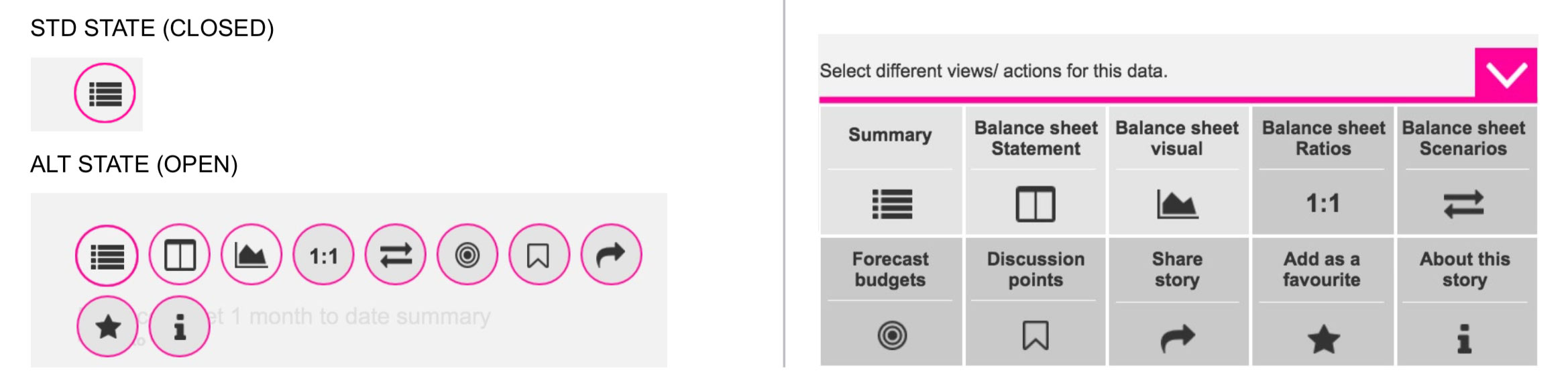
Specific functionality on this widget actions:
- Summary An overview of the widget at this point of time. (Controlled by date settings set elsewhere). Usually includes, as of today, maximum, minimum and averages, so the user can gain a solid understanding at that point of time. For the Balance sheet widget we did this for Assets, Liabilities, Current Assets, Non-Current Assets, Net Assets, Current Liabilities, Non-Current Liabilities, and Equity Position.
- Accounting standard statement - chart/ statement/ table. Included when needed, as not every widget story will have charts to match.
- Visuals Visuals about your current financial situation overview. Visuals can also display under ratios and scenario topic areas, where they visualise the content that's displayed.
- Ratios As found out during interviews, ratios give a user a strong understanding of their financial position. We would list all the ratios that are beneficial, and have the ability to see trends through visuals as well as explanations on what they are calculating, and how to determine whether your ratios are healthy. For the Balance sheet widget we focused on the Current Ratio, Debt Ratio, and the Debt to Equity ratio.
- Scenarios Super beneficial to find out what is affecting your current position, and if you altered certain aspects, what effect would it have. For the Balance sheet widget we focused on: lost income, gained income, Paid Extra and paid less. These options gave the client the ability to see how this manipulation would effect their ratios, as well as see this through a visual representation.
Common functionality found on all widgets:
- Budgets & Forecasting. Set by the advisor, these are financial/ Business targets/ KPIs that the User should be aiming for. Different for each widget, and only set once per widget, and not per category. For the Balance sheet widget we focused on goals like: "Goal: Raise your equity position by $500,000", and "Lower your current Liabilities by $25,000" etc.
- Discussion points (future state). This would allow users to set follow-up "flags" on widgets regarding areas that didn't understand, and wanted the advisor to reach out to discuss.
- Share a story Enabling users to share their widget story with another.
- Adding as a favourite so that it can be easily found, and appear at the top of the lists.
- About the story Puts the power back into the users hands so that they can understand more about their financial standing. Spend less time asking about the basics, and more time asking what you need to take advantage of the advisory services. For the Balance sheet widget we focused on signs of a healthy and unhealthy Balance sheet, what to look out for and what our iconography means. Also a chance to ask your advisor with any questions.
Conclusion
Designing out of your comfort zone can be an absolute blessing. Not only will you learn all about your new subject area, but you have the chance to ask many questions, and question the experts why they do tasks they way they do. You have fresh eyes, a fresh perspective, and you can hypothesise and challenge your perspective to why tasks may be tricky, or why you might not have the information retention rate you were hoping for. It is easier to ask yourself: what happens to me when I use this product? Am I the only one?! And the value in collecting and organising data through research!